It can be difficult to browse older websites that were developed years ago. Some of these sites have not been updated to a responsive design adaptable for browsing on small phone screens.
Opera app has the feature to switch to desktop view that support a desktop page layout. The website will be loaded in browser as if you’re viewing it on a desktop resolution.
In this guide, I have shared written instruction about:
Loading the Site in Desktop Layout
The desktop layout make it easier to help loading the websites that are not compatible with the phone devices. It help me loading full desktop view. Follow these easy steps to enable:
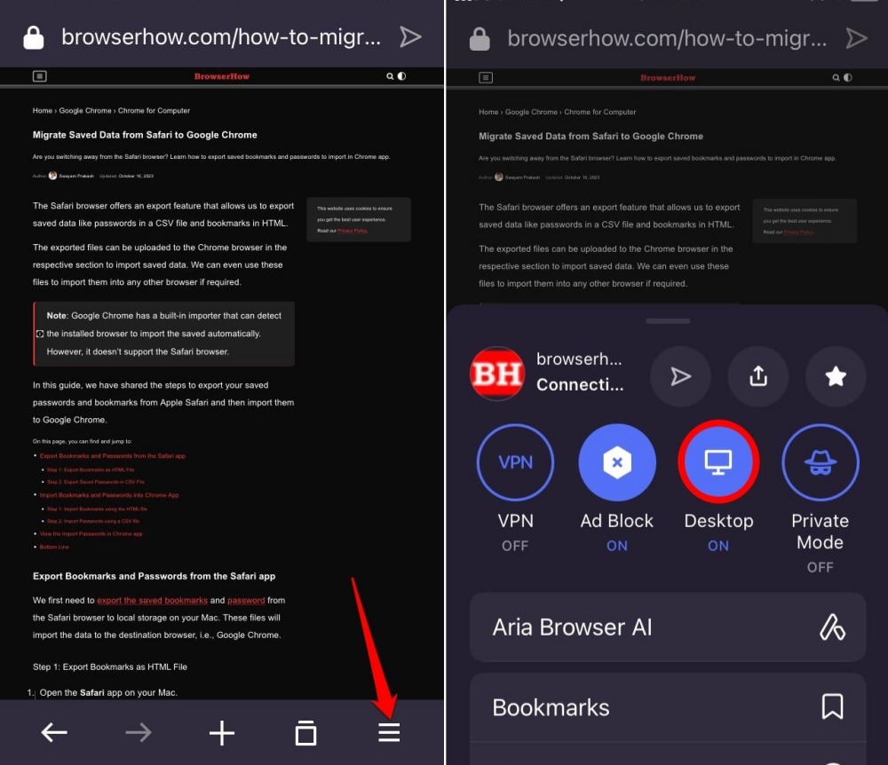
- Launch the Opera app on your iPhone or iPad.
- Browse any page on a site.
- Press the More
 button and tap on the Desktop button to enable it.
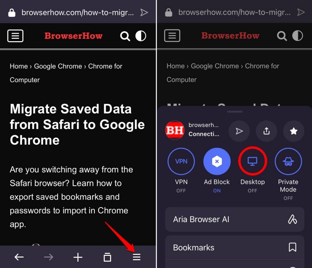
The Desktop icon will turn Blue indicating the desktop mode is turned on.
If you’re unable to read the content, then you can use your fingers to pinch and zoom on the screen to view the page contents.
Reverting Back to Mobile View
If you want to switch back to the phone mode or mobile view, then you can turn off the desktop mode settings in Opera app. Follow these steps:
- Open the webpage that is available in Desktop mode.
- Tap on the More button for menu list.
- Tap on the Desktop to turn OFF the desktop site view.
The page will reload and revert back to normal as mobile site view.
Bottom Line
If you cannot view the page content on mobile view due to design limitations, you can switch to desktop view to load the full version of website. It also helps in loading the sites that are limited only to desktop screen resolution.
Similarly, if you are browsing on your computer, you can load the mobile site layout on the Opera browser using the in-built developer mode.
Lastly, if you've any thoughts or feedback, then feel free to drop in below comment box. You can also report the outdated information.