
The Opera browser has a built-in developer mode feature that allows switching the desktop site layout to the mobile site view.
It allows you to choose from different preset mobile resolutions or enables the responsive mode to adjust the screen width. It helps the web designer test the layout on a mobile screen using a desktop browser.
In this guide, I have shared written instruction about:
Enable Mobile Site with Developer Mode
Opera’s developer mode helps test a website in different screen resolutions. However, we can use this to enable the mobile view toggle to view different screen layout sizes. Here are the steps to view a mobile site layout:
- Launch the Opera browser on your computer.
- Open the website you want to view as a mobile site.
- Click on Opera

 for the menu list.
 - Select the Developer menu and choose Developer Tools.
A developer window or console will open. - Click on the Toggle Device toolbar button.
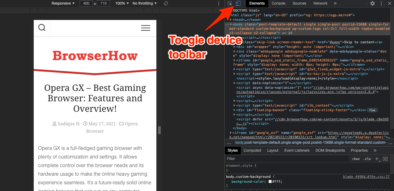
 It will shrink the site layout to responsive mode.
 - Click the Responsive drop-down, and choose any make or model for desired resolution.
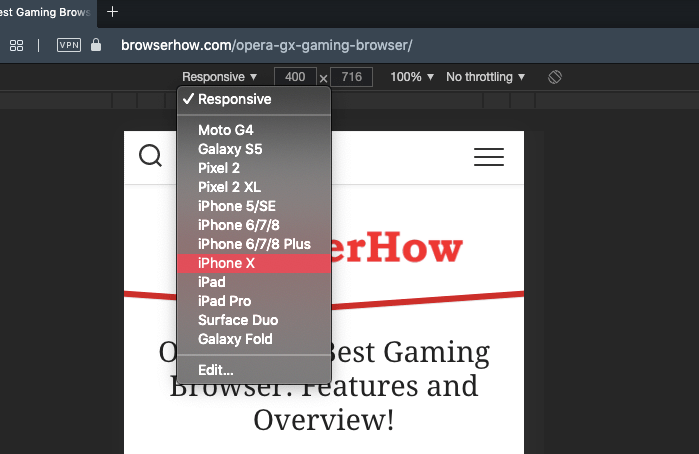

Selecting any phone or tablet model from the list of options will adjust the screen resolution and display the mobile or tablet view.
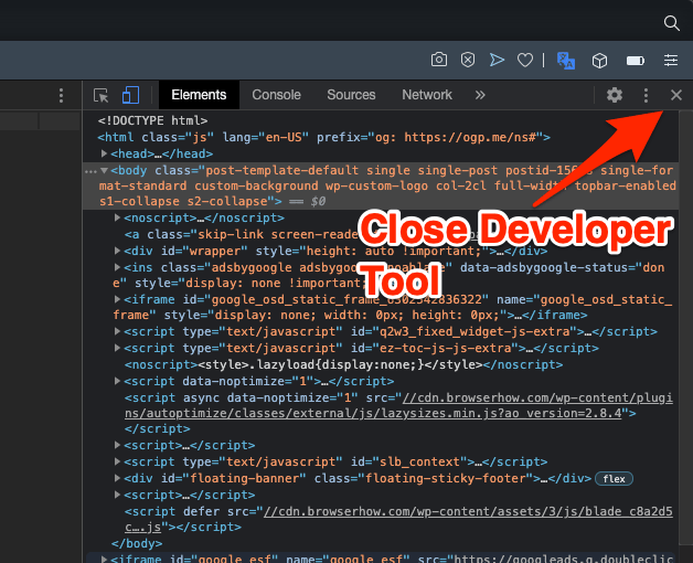
Click the button on the developer window to switch to the desktop version.
For Mac users, the developer menu is available in the menu bar. You can also use the Opera keyboard shortcut + + to enable developer tools on Mac.
Bottom Line
The developer mode in Opera browser is mostly used for developing and testing the cross-device fully functional website. However, a general user like us can use this feature to enable the mobile site view within the computer browser.
If the website is enabled with a responsive design, the mobile site view will look great even on smaller screen sizes. However, it might get distorted or trimmed at the edges for a non-responsive site.
Lastly, if you've any thoughts or feedback, then feel free to drop in below comment box. You can also report the outdated information.


really useful, thanks!