Some websites are designed specifically for desktop users. If you browse these sites using a phone, most parts of a page may not be visible on the smaller screen.
To fix that issue, you can change the page view layout to desktop mode. The Brave browser offer the feature to switch to desktop view.
In this guide, I have shared written instruction about:
Using the ‘Request Desktop Site’ feature
The Brave browser has the feature named as Request Desktop Site that will automatically load the desktop layout of the site. It mimics the desktop screen resolutions. Follow the steps:
- Launch the Brave browser on your iPhone.
- Access any site or page of your choice.
- Tap on More
 for options and select Request Desktop Site from the context menu.
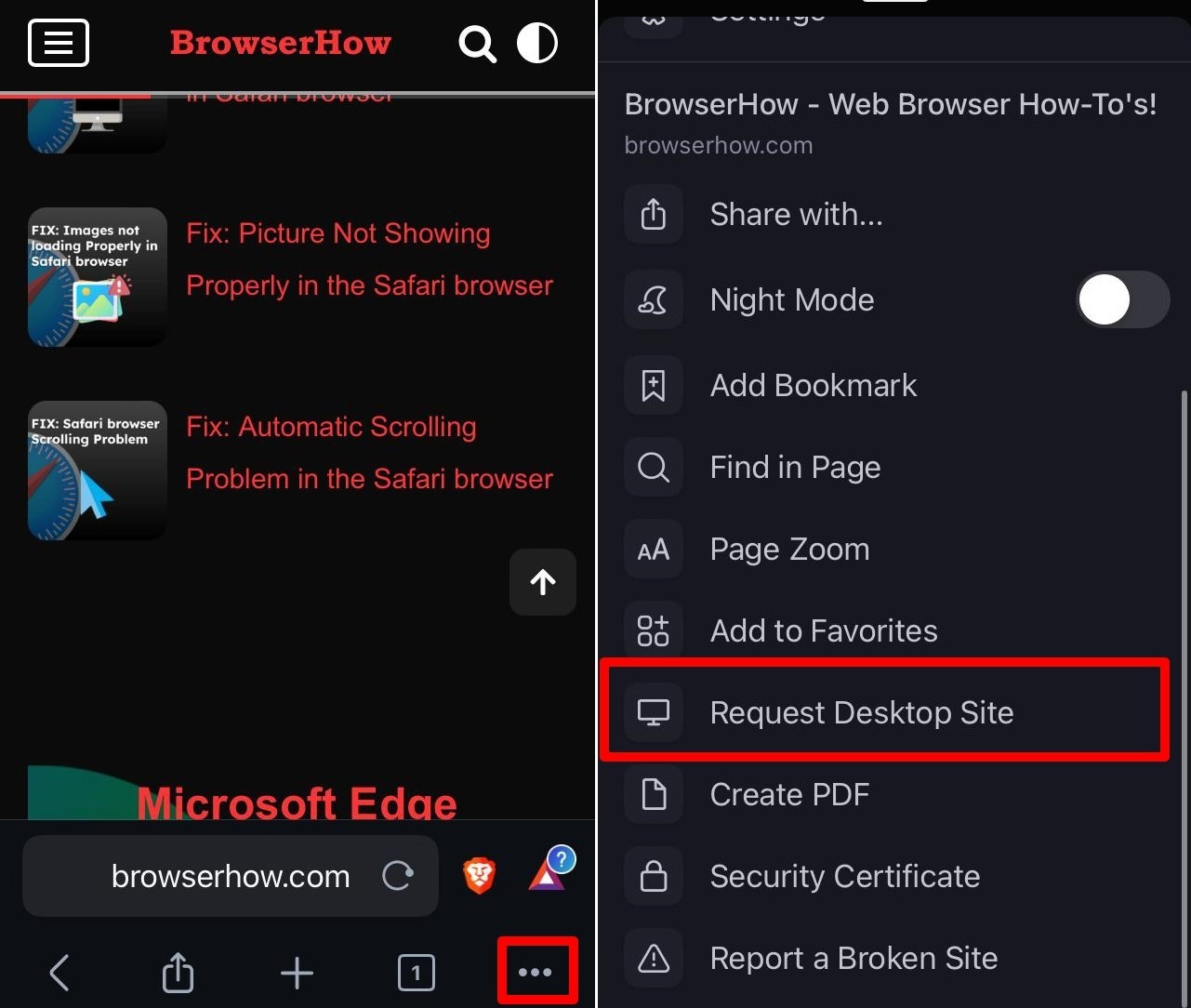 It will reload the page in desktop layout.
Switching to desktop view will make the whole page visible but the font will be minimized. Use pinch zoom with your fingers to navigate the content on a page.
Revert Back to Mobile Site View
Now, to revert back to desktop site mode, you can tap on the same options menu and select Request Mobile Site option.
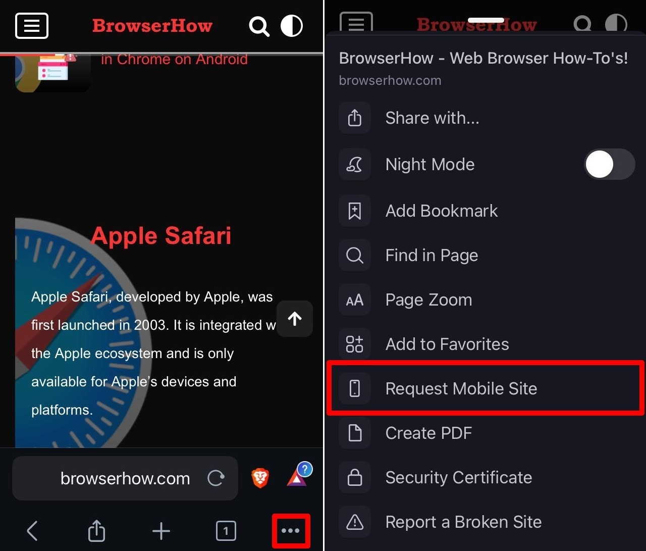
It will change the view to mobile site.
Bottom Line
You can easily switch to desktop view on Brave app and view the website in fully functional mode. The mobile will continue to load in desktop site even after reopening in later.
Similarly, you can change to mobile site view from desktop view on Brave browser for computer.
Lastly, if you've any thoughts or feedback, then feel free to drop in below comment box. You can also report the outdated information.