The Brave browser allows switch to the mobile site layout on its desktop browser. You can enable the developer mode within Brave and use the device toggle option to view the mobile view.
We can use pre-defined mobile screen resolution or customize width and height per our need using the responsive layout option.
In this guide, I have shared written instruction about:
Enable the Mobile Site Layout
Most modern websites these days are responsive, which means they adjust according to the screen resolution size of the device. The Brave browser offers developer tools that mimic the mobile resolution of the desktop browser.
- Launch the Brave browser on your computer.
- Open the website you want to view on the mobile site.
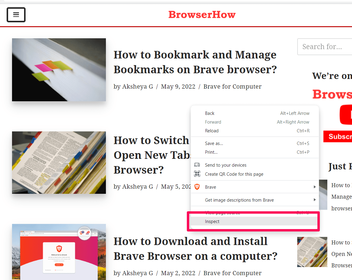
- Right-click on the page for the context menu and select on Inspect option.
 It will enable the developer mode and launch the developer tools window.
 - Click on the Toggle Device Toolbar button.
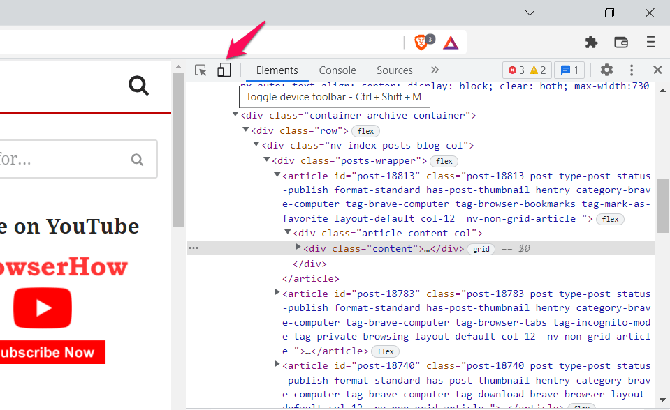

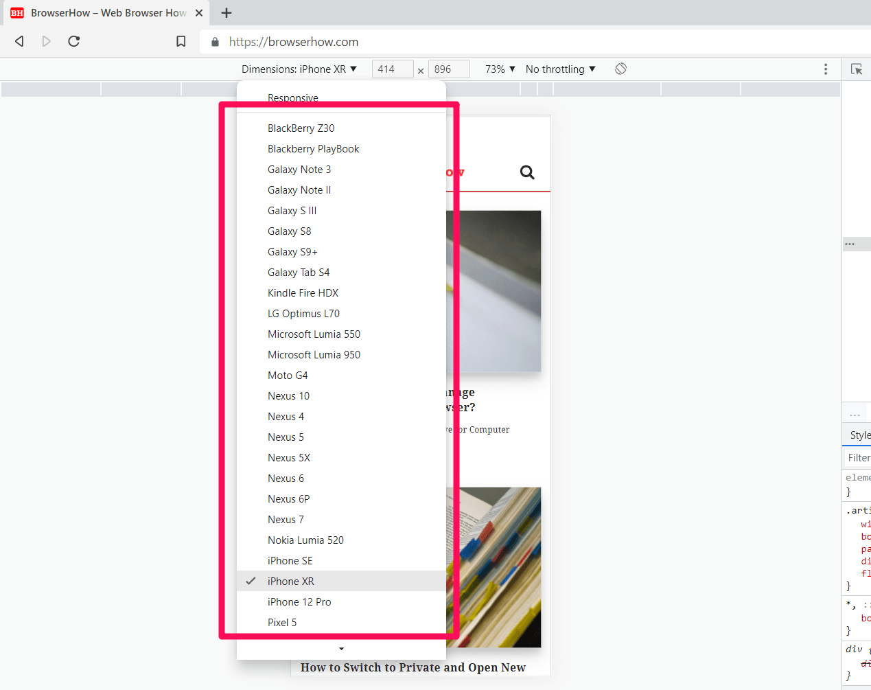
It will turn blue when it is enabled. - Select the device model to emulate from the drop-down.
The browser will display the mobile version of the site. The screenshot displays how the website looks on an iPhone XR. The list of iOS and Android devices to imitate from the Dimensions menu will help choose the suitable resolution for the test.
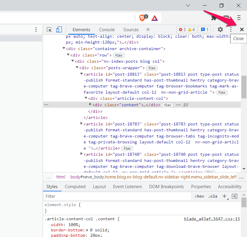
You can close the developer tool pane once you are done to go back to the original view.
You can use the keyboard shortcut to access the developer tools directly. You can also simultaneously press / + + keys to access developer tools.
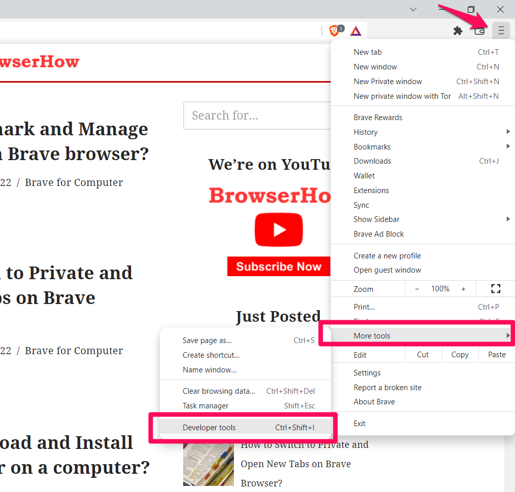
Another alternative is using the Developer tools under the More tools menu from the More menu options. Once you are done debugging, exit the Developer tools pane to close the Mobile site layout and bring it back the normal.
Bottom Line
Whether you’re a web developer or a blog owner, you must ensure the site runs perfectly on all devices.
We can select the variant of a device you want to view the site on and check the mobile site view on the Brave browser with the help of the developer tools.
Similarly, if you use the Brave on your smartphone, then we will have the option to view Desktop Site layout on your small screen. It works exactly the opposite of the desktop browser.
Lastly, if you've any thoughts or feedback, then feel free to drop in below comment box. You can also report the outdated information.