Modern websites are designed to adapt to different screen resolutions and resize accordingly, which is known as responsive design.
However, few websites are still using old technology and work only on higher screen sizes like desktops. To tackle this issue, the Edge browser has a built-in feature that allows switching to a desktop site view.
In this guide, I have shared written instruction about:
Enable the View Desktop Site option
The option to turn the desktop site is available under the options menu. You can choose the ‘View Desktop Site’ to enable it.
- Launch the Edge app on your iPhone.
- Open the site address which you want to view in the desktop view.
- Tap the More
 for the options list and select the View Desktop Site option.
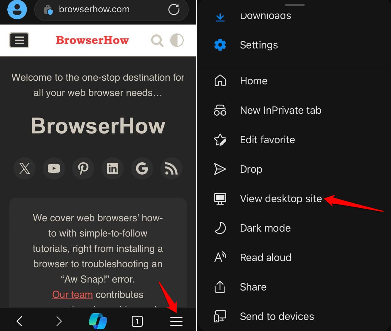
The page will immediately reload and display in the desktop variant.
Return to Mobile Site Layout
If you wish to switch back to mobile view, then you can use the same option to turn off the desktop site view.
- Launch the Edge app on your iPhone.
- Tap the More button and select the View Mobile Site option.
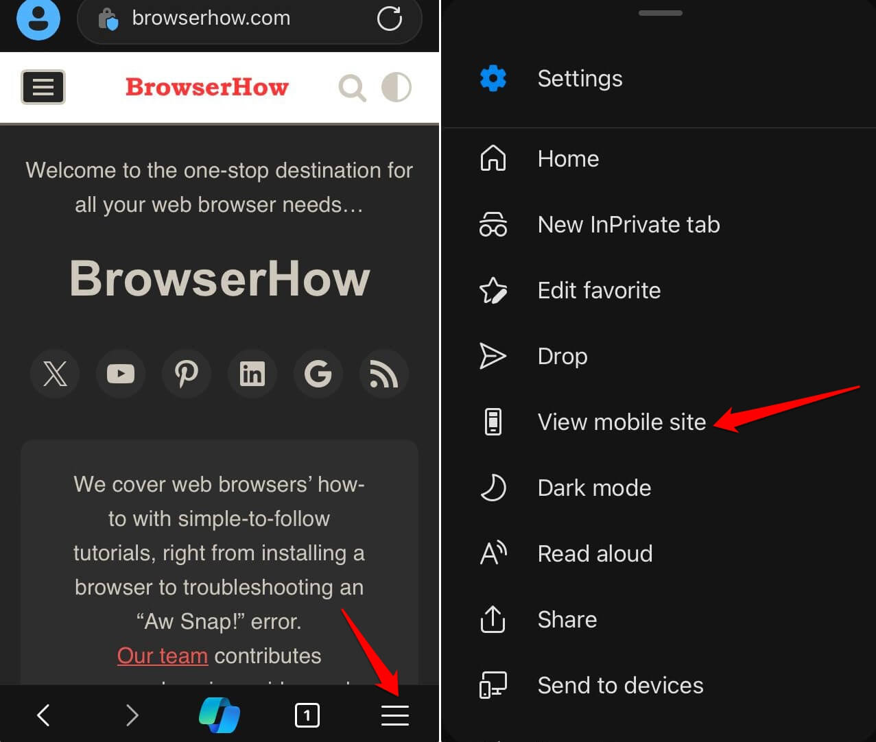
It shall revert the desktop layout to a normal mobile site.
Note: If you close the browser tab while the page is in desktop view, it will appear in mobile site view on revisiting the page.
Bottom Line
If the website is not loading properly on your phone in mobile layout, then switching to desktop view can help you. As mentioned, most of the websites have responsive design which can help in easily switching the design based on screen resolution.
Similarly, you can:
- Enable Mobile Site View in Edge on the Computer
- View the Desktop Site in the Edge browser on Android Device.
Lastly, if you've any thoughts or feedback, then feel free to drop in below comment box. You can also report the outdated information.


