

On a computer, Edge has no mobile-site switch like Edge for Android. To check a site’s phone or tablet layout, use Device mode in Microsoft Edge DevTools.
Open Developer Tools, turn on the device toolbar, pick a phone or tablet from the Device list, and reload the page. The preview changes the viewport, but the site can still serve desktop content if it ignores screen size.
In this guide, I have covered:
Contents
See a site’s mobile layout in Edge on your computer
You’re on a computer, you want the phone version of a page, and Edge has no mobile-site switch in its main menu. The closest match is Device mode in Microsoft Edge DevTools.
Edge does not provide the Show mobile site as default control found on Android. Device mode changes the page viewport so you can check a responsive phone or tablet layout. It does not always change the user agent or force a site to serve its mobile version.
Enable Device mode in Microsoft Edge
You won’t find a mobile-site toggle in Edge’s main menu. Open the page you want to inspect, then use DevTools to enter Device mode.
- Open the website you want to inspect in Microsoft Edge.
- Click the
 menu labeled More.
- Hover over More tools.
- Select Developer tools from the More tools menu.
- Click the phone-and-tablet icon in the DevTools toolbar. Its tooltip may read Toggle device toolbar or Toggle device emulation, depending on the Edge build.
- Choose a phone or tablet from the Device list.
- Select Mobile in the Device type list for touch emulation, or Mobile (no touch) for a mobile layout without touch input.
- Reload the page to apply the selected viewport.
Microsoft Edge displays the selected device frame around the page:
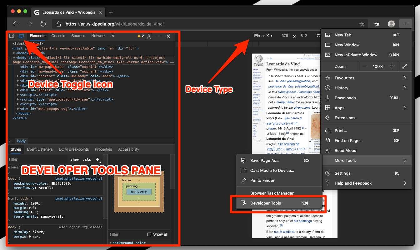
You’ll know it worked when the page narrows to the selected device size and the DevTools device controls stay visible. Edge may show DevTools beside the page or in a separate window, depending on your layout.

On Windows and Linux, press to open DevTools directly. With DevTools open, press + + to toggle the device toolbar.
Choose a phone, tablet, or custom viewport
If the default preview does not match the screen you need, use the controls above the emulated page. A preset gets you close to a real phone. A custom width lets you test a specific breakpoint.
The Device list selects a preset model, while the separate Device type list controls Mobile, Mobile (no touch), and Desktop behavior. For a custom test, set the viewport dimensions and reload:
- Enter the target width in the Width field.
- Enter the target height in the Height field, or leave it at the default value.
- Reload the page so the site recalculates its responsive layout.
For layout checks, we usually start with a preset phone before trying custom widths. It is faster, and the preset names make the test easier to repeat.
When the mobile site does not appear
You turned on Device mode, but the page still shows desktop navigation. That can happen when a site chooses content by user agent or Client Hints instead of viewport width.
Edge’s device preview is a layout test, not a guaranteed switch to a separate mobile domain or app. Work through these checks:
- Confirm that Device type is set to Mobile or Mobile (no touch).
- Reload the page after changing the selected device.
- Check the site for its own mobile or desktop option, if it offers one.
- Test the site on an actual phone when server-delivered mobile content matters.
Device mode tests layout only. If one URL looks wrong while the rest of Edge behaves normally, the site is probably choosing content on its own. The View Site Info and Permission Settings in Edge on a Computer guide covers the controls that can affect what a page loads.
Turn mobile view off
When you finish checking the mobile layout, turn off the device toolbar to restore Edge’s normal desktop view.
- Click the same Toggle device toolbar or Toggle device emulation icon in DevTools.
- Close DevTools if you want the page to fill the Edge window again.
You’ll know it worked when the narrow device frame disappears and the page returns to the full width of the Edge window.
How this differs from Edge on Android
If you’ve used Edge on Android, you may expect a similar site-view switch on your computer. On a phone, Edge has a built-in way to switch to desktop site view in Edge on Android. On a computer, Device mode is a temporary developer preview used from DevTools, not a permanent setting for each site.
That difference matters when you want a site to remember your choice. Device mode does not save a mobile-site preference per site, so you turn it on and off as needed.

Frequently Asked Questions
How do I enable mobile view in Microsoft Edge on a computer?
Open DevTools, click the Toggle device toolbar or Toggle device emulation icon, choose a device from the Device list, and reload the page. Edge on the computer has no separate mobile-site switch.
Does Edge on the computer have a Show mobile site option?
No. Edge on Android includes a mobile or desktop site control, but the desktop version uses DevTools Device mode instead. Device mode is a temporary preview, not a saved site preference.
Will Edge DevTools always load a site’s mobile version?
No. Device mode changes the viewport and can trigger responsive breakpoints, but the site may still deliver desktop content if it relies on user-agent or Client Hints checks. Use the site’s own mobile or desktop option when its content matters.
Why is the page still wide after I turn on mobile view?
Confirm that Device type is set to Mobile or Mobile (no touch), then reload the page. If desktop navigation remains, the site may be serving a desktop version regardless of the viewport.
How do I return to the desktop view in Edge?
Click the device toolbar icon again to turn Device mode off. Close DevTools if you also want the page to fill the Edge window.
somehow this doesn’t fix when you use a Vertical Monitor even if you change into mobile mode . kind of weird it fixes itself when I change to horizontal monitor
Does this allow for use like a mobile device? Wondering how to simulate press/long press and other actions on a tablet rather than just behavior like right click/left click on mouse.
thanks very helpful
My computer seems to be stuck in mobile view. Web pages are displaying in windows edge as mobile sites. How can I turn this off.
Hi Pam, did you enabled Developer mode by any chance? Just closing the developer mode window should resolve the problem.
Hi Pam, did you enabled Developer mode by any chance? Just closing the developer mode window should resolve the problem.