Firefox offers a responsive design mode option that allows us to choose from different device types and layouts.
The responsive design is part of developer mode, which can be enabled under the Firefox options menu. To test a website’s layout, we can choose from the preset list of devices or add a custom resolution.
In this guide, I have shared written instruction about:
Loading the Mobile Site View
Responsive web design technique allows developing sites that can change dynamically as per the screen’s resolution.
The easiest way to view the mobile site is to resize the browser window. However, this option only seems appropriate sometimes because you need to know the exact screen resolution the site is loading on. That’s when developer tools or developer mode help.
- Open Firefox computer on your computer.
- Open the website URL you want to view as a mobile site.
- Click on the More

 options for the menu.
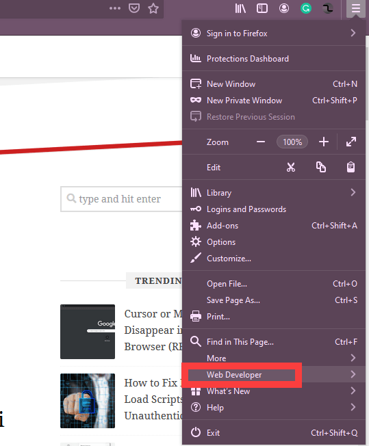

- Select the Web Developer > Responsive Design Mode option.
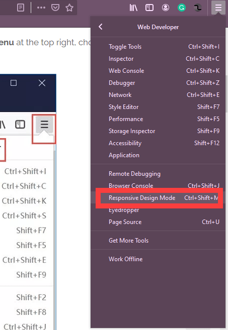
 It will load the developer tools window.
 - Select the device you want to preview the website from the device selection drop-down.
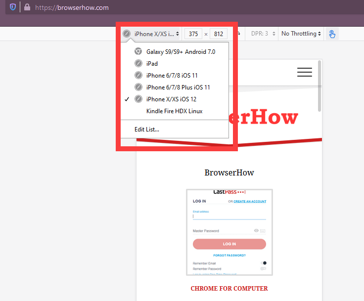
 It will change the website layout to the selected device resolution.
You can choose a particular smartphone model to preview your site’s appearance on that specific smartphone. It also displays the screen resolution size.
Bottom Line
Mozilla Firefox’s Developers Tools help you select different mobile view layouts and sizes from the drop-down list with the latest models of smartphones.
However, if you have found that your device is not listed in the drop-down list, scroll down the list to the end, where you will see the Edit List option. You can add the desired screen resolution on this screen and save it in the browser for repeated use.
Lastly, if you've any thoughts or feedback, then feel free to drop in below comment box. You can also report the outdated information.