
The Safari app includes a “mobile site view” feature that allows users to view web pages as they appear on their mobile devices.
To enable this feature, you need first to enable the Develop menu and then choose open to enter the Responsive Design Mode, which allows you to choose different screen resolutions, including the mobile layout.
In this guide, I have shared written instruction about:
Enable the Develop Menu in Safari app
We need to enable the Develop menu to view the responsive site option. The developed menu is hidden by default, but you can easily enable it. Here are the steps to enable:
- Launch the Safari app on Mac.
- Click on the Safari menu option.
- Choose Preference from the list to open the dialog window.
- Switch to the Advanced menu option.
- Enable the checkbox against the — Show Develop menu in the menu bar.
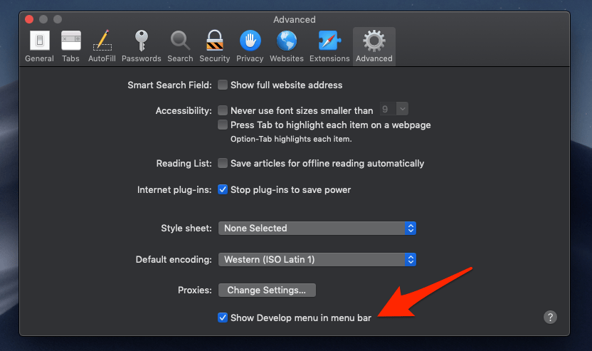

It will enable the Develop menu in the Safari browser menu bar list.
Start the Responsive Design Mode
No standalone option can help us reach the mobile responsive web design. However, the option is hidden under the Develop menu. It will help you display the mobile view in the Safari browser on Mac. Here are the steps to view mobile responsive web design:
- Launch the Safari browser on a Mac.
- Open the website that you want in the mobile site view.
- Click on the Develop menu for options.
- Select the Enter Responsive Design Mode option from the drop-down.
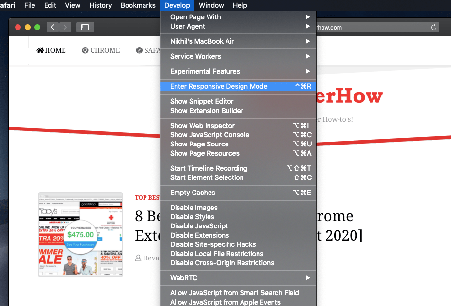

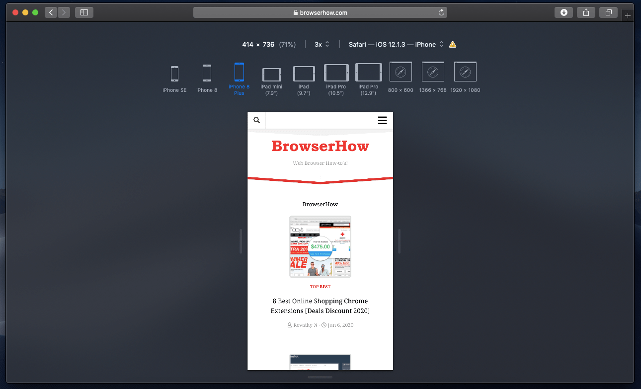
This will reload the website and enter into responsive design mode. Here you can select the different device types and screen resolutions based on your needs.
Simply switch between the iPhone or iPad models listed on the page to view the mobile site on the Safari computer browser.
Bottom Line
This will enable us to view the mobile responsive site on the Safari browser on the macOS computer. The mobile site will be based on the model selected in the responsive design mode.
Similarly, you can enable the desktop site view in Safari on iPhone and iPad. It will help in retrieving the full desktop experience on a small-screen device.
Lastly, if you've any thoughts or feedback, then feel free to drop in below comment box. You can also report the outdated information.


Or just change the user agent to iPhone: Developer > User Agent (2nd option)
Although it changes the viewport, it does not actually convince a site that you are really on a mobile device, at least with facebook, which produces the desktop features of the site, but just in a smaller window.