
Some sites are developed explicitly for desktop screens; hence, several options, tables, design elements, etc., are hidden if they are browsed on a small screen. But if you want to access all the features and options on a mobile phone, you can enable the desktop site layout.
To open the desktop layout in the Chrome app, you can select ‘Request Desktop Site’ from the menu options to switch.
In this guide, I have shared the video tutorial and written instructions about:
Watch the Video Guide
Find the video guide helpful? Please consider subscribing to our YouTube channel for more such videos.
Request the Desktop Site View option
The font size and media elements might look smaller since we are visiting a desktop site on a mobile phone; the experience will be mostly like that we view on a computer screen. Here are the steps to view the desktop site:
- Open the Chrome app on your iOS/iPadOS.
- Open the website to view the Desktop layout.
- Tap on More

 for the menu list and select the Request Desktop Site option.
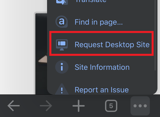
 The website will reload, and you will see the desktop view of the website.
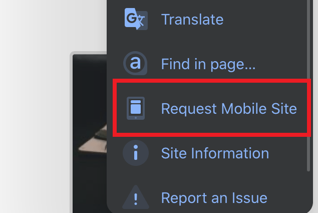
To switch back, you can choose the Request Mobile Site option at the same place under the menu list.
Note: You can pinch-zoom in to magnify the screen if you don’t see texts or tables on your smartphone screen.
Bottom Line
If you want to experience desktop sites on your iPhone, then Chrome browser lets you do that. With the ‘Request Desktop Site’ feature, you can easily switch to a desktop layout on the phone screen.
Similarly, you can:
- Enable Mobile Site View in Google Chrome on the Computer
- View Desktop Site layout in Google Chrome on Android.
Lastly, if you've any thoughts or feedback, then feel free to drop in below comment box. You can also report the outdated information.


OMG yes it’s hidden in the scroll down part of the command list why on earth would the developer only display partial of the command hoping users are born to know there are more options there unbelievable
Glad you found it! 🙂
I changed the option but now chrome always works for me with sites in desktop mode and I have to explicitly select the option for mobile sites
Hello Enrico, just disable the checkbox to make it load in normal mode/view.
I have the same problem as Enrico and there is no checkbox to uncheck.
Apologies, my bad. There isn’t any checkbox, but you will find the option “Request Mobile Site”. Just tap on the option to revert back the change.
To everyone who can’t find it. I found it next the url box..click the icon “Aa” and it will be listed there
Just tried it May 28, 2021 on boss’s iPhone. Yup, you have to slide/scroll within the menu that does not have anything that makes it apparent you can slide down. No visual indication that was an option, no scroll side indicator. Google needs to at lease put one of those double down arrows to indicate this.
This option appears to have been removed
To all the people on here saying that the option isn’t there, you are wrong. You open the menu, then you SCROLL (within the menu) down, and the option to “request desktop site” is right there. It never disappeared, and it’s still there now.
There’s no three dots on the bottom right anywhere this does not work for me
Which device are you using? Is it an iPad? The 3 dots menu is located at the top right on the Chrome iPad.
Doesn’t work and now request desktop is grayed out and no longer an option
Hi, please access a website in the browser and then check the option. The request desktop site option will stay grayed out unless you are on a webpage.
If you’re not holding it horizontally it won’t work on iOS 14. Once you turn your phone it shows up.
2021-03-08; ios chrome “request desktop” option not found anywhere
Hi Steve, I can see the Request Desktop Site option. Can you please scroll to the menu options list? I think you missed the scroll down.
I have the same problem. My chrome is version IOS 87
This doesn’t work, there is no option to request desktop site from the menu.
Try scrolling down, I was having trouble too, but then something happen and I saw you could scroll down 🙂