
Google Chrome offers developer tools that help you view the site in different screen sizes. Web developers or designers must check the website’s appearance on different device configurations and resolutions.
Using the device toggle switch, you can easily enable the mobile site view on the desktop computer from the same developer mode.
In this guide, I have shared the video tutorial and written instructions about:
Watch the Video Guide
Find the video guide helpful? Please consider subscribing to our YouTube channel for more such videos.
View the Mobile Site Layout
Developers often use the mobile site view when testing and launching a new website design. It helps check the website’s compatibility and user experience when visiting small screens. Here are the steps to enable mobile site view:
- Launch Google Chrome on your computer.
- Open the website that you want to view on the mobile site.
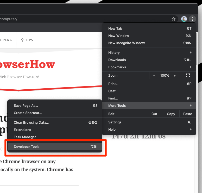
- Click on the More

 menu for options.
 - Hover over the More Tools option from the list.
- Select Developer Tools under the More Tools menu.
 It will launch the Developer Tools pane in the browser.
 - Click on the Device toggle icon to enable the mobile site view mode.
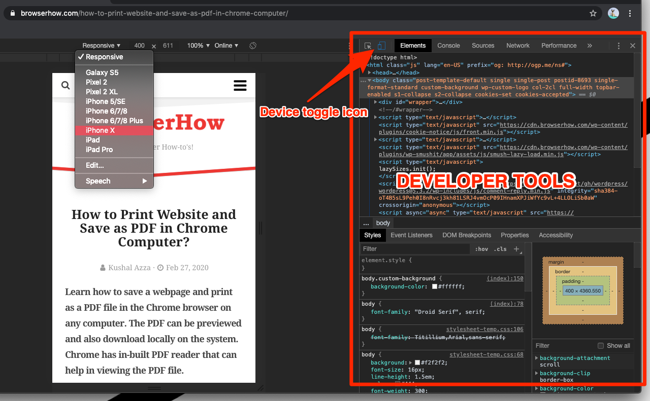
 It will load the mobile site user interface.
You can also choose the make and model of the device from the dropdown menu to select the desired device experience.
Once you close the developer tools console, the website will reload as a desktop site. If we view the mobile sites on desktop Chrome, it will help you analyze the look and feel of the website better!
Bottom Line
The mobile responsive site feature within developer tools helps test and develop a mobile site without using small-screen devices. You do not have to switch devices to view the site design.
Using the responsive mode, you can drag to control the various screen sizes.
Similarly, you can:
- View Desktop Site layout in Google Chrome on Android
- View Desktop Site layout in Chrome on iPhone & iPad.
Lastly, if you've any thoughts or feedback, then feel free to drop in below comment box. You can also report the outdated information.


Hello! I use a device that is ran by an administrator, and am unable to access the “Developer Tools” section. Is there another way that I could access a mobile version?
The easiest way is to resize the browser window to adjust the resolution to mobile size.
First, exit the full screen or expanded mode, then drag the browser window’s left or right side to adjust it to the desired width.
How stop mobile version when clicking on hyperlink in Excel?
I have a set of facebook profiles listed in my Excel spreadsheet, the problem is that when I click on any profile, it opens up with both mobile version and the web version. I need to stop the mobile version so that when I click on the profile it only opens the web version.
P.S :
I tried different browsers (chrome, Mozilla, Opera, ets), but it’s all the same. I also tried to delete m.facebook.com/… from Chrome setting, but unfortunately this trick did not work.
Please note that this problem only happen with facebook profiles, but when trying other sites like google or any other site, it opens normally and only with web version.
please help me fix this problem!
Use www.facebook instead of m.facebook for desktop version.
So, there’s no way to stay on mobile mode without an extention app switcher? The code on the right gets in the way. But I see you can click the 3 dots in the DevTools area and click ‘undock into separate window’.
Yes – we can undock and continue mobile view in a separate window. However, the developer window will still be active. Maybe minimizing or hiding it should help from distraction.
I did exactly like this now want disable. Could you white about How to DISABLE Mobile Site View in Chrome Computer?
Click on the same device toggle button that enabled the mobile site view. Else, you can also close the developer tools window to turn off Mobile Site View in Chrome computer.