
Most websites have adopted a responsive web design so that the users can view the entire page on their smartphone without compromise.
However, we can switch to the Desktop site to view the full desktop layout. Open the menu list and select the Desktop site checkbox option from the list.
In this guide, I have shared written (and video) instructions about:
Watch the Video Tutorial
Find the video guide helpful? Please consider subscribing to our YouTube channel for more such videos.
Enable the ‘Desktop Site’ option
The desktop site view helps view all hidden menus and options, just like we see on the desktop. The font size and elements might look smaller since we are visiting a desktop site on a mobile phone. Here are the steps to follow:
- Launch the Chrome app on Android.
- Open any website that you want to view in desktop mode.
- Tap on the More
 menu options.
 - Select the checkbox against the Desktop site.
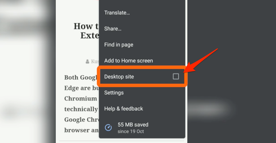
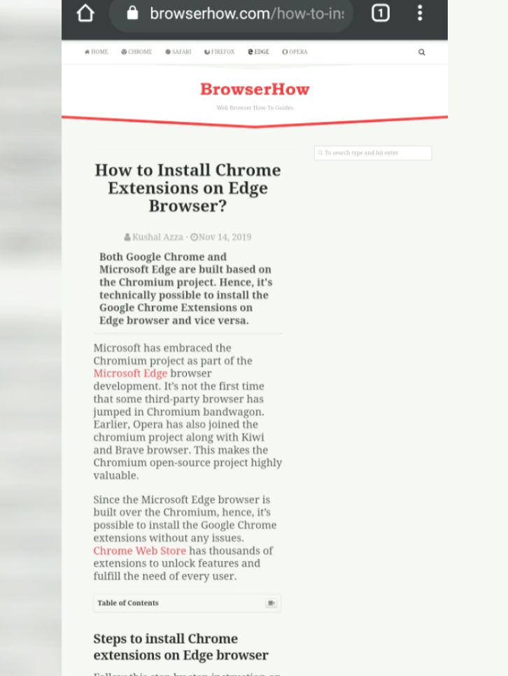
The page will automatically reload and display the desktop site view on the mobile phone.
If you want to switch back to the original mobile view, then undo the checkbox on step #4. The page will reload, and you will see the mobile site view.
Bottom Line
You can experience the full desktop site view on Chrome Android by enabling the desktop view. The desktop view will automatically load on the small screen when you try to load the site.
Similarly, you can:
- View Desktop Site layout in Chrome on iPhone & iPad
- Enable Mobile Site View in Google Chrome on the Computer
Lastly, if you've any thoughts or feedback, then feel free to drop in below comment box. You can also report the outdated information.

I tried several browsers on my android. It is as said above. The sites (developers) recognize it’s a mobile and forces a mobile site. But a lot of sites exclude menus, buttons and what not… in their mobile sites. MySolarEdge…. pc for changing energy price. Shell recharge…. pc for changing anything re. loading pass, your home loading dock etc. Twitter Library….only on pc. Etc etc etc etc.
WE NEED A SWITCH THAT IGNORES THE FACT WE ARE MOBILE.
We will just swipe our way thru the screen, as long as we can get things done without pc
For those who constantly say to use the desktop function of chrome, I have the impression that you have never done it yourself. So, do this test to convince yourself that it’s crap: Open Gmail in destop mode on your android smartphone and try to add labels and sub-labels to a label. The menu is simply not offered. (note that on android tablet this is possible). According to Gmail, the solution is to go to a pc each time you want to classify an email. What the fuck… today a lot of people don’t even have a PC. And even if it is, it’s ridiculous not to have all the functions on an android application like on PC.
Hello,
Thank you for the helpful information. However, I am confused regarding what I it best for my android? Desk top mode or mobile?
On Chrome I can go to the three dots & click desktop view if desired.
The confusion is to turn on request desktop view in settings by turning it on but I may not want it all the time so should I just leave it turned off & click the three dots to click desktop view when desired?
I hope I explained my question so you can understand what I am asking!
Thank you for your help!
Have a beautiful day!
Hi Michael, most of the websites (including us) offer a different layout for different screen sizes. It’s the same site but changes based on the screen resolution, and it’s known as responsive web design.
Answering your question (correct me if I am wrong!) – It’s a good idea to keep the mobile layout on the smartphone rather than the desktop view all time. The font sizes and images on the mobile screen are often squeezed when using the desktop mode, which makes the mobile site view apt for mobile resolution. As you mentioned, you can turn it on and off when you desire.
Hope this helps!